Introduction to Grids
Using CSS, you can elegantly lay out elements on a web page. The Box Model and Display and Positioning explain some possible ways to style layout.
The grid can be used to layout entire web pages. Whereas Flexbox is mostly useful for positioning items in a one-dimensional layout, CSS grid is most useful for two-dimensional layouts, providing many tools for aligning and moving elements across both rows and columns.
grid-template-columnsgrid-template-rowsgrid-templategrid-template-arearow-gap/column-gap/gapgrid-row-start/grid-row-endgrid-column-start/grid-column-endgrid-area
Creating a Grid
To set up a grid, you need to have both a grid container and grid items. The grid container will be a parent element that contains grid items as children and applies overarching styling and positioning to them.
To turn an HTML element into a grid container, you must set the element’s display property to one of two values:
grid— for a block-level grid.inline-grid— for an inline grid.
Then, you can assign other properties to lay out the grid to suit your needs.
.grid {
  display: grid;
}
Creating Columns
By default, grids contain only one column. If you were to start adding items, each item would be put on a new row. To change this, we need to explicitly define the number of rows and columns in our grid.
We can define the columns of our grid by using the CSS property grid-template-columns. Below is an example of this property in action:
.grid {
  display: grid;
  width: 500px;
  grid-template-columns: 100px 200px;
}
This property creates two changes. First, it defines the number of columns in the grid; in this case, there are two. Second, it sets the width of each column. The first column will be 100 pixels wide and the second column will be 200 pixels wide.
We can also define the size of our columns as a percentage of the entire grid’s width.
.grid {
  display: grid;
  width: 500px;
  grid-template-columns: 100px 200px;
}
In this example, the grid is 1000 pixels wide. Therefore, the first column will be 200 pixels wide because it is set to be 20% of the grid’s width. The second column will be 500 pixels wide.
We can also mix and match these two units. In the example below, there are three columns of width 20 pixels, 40 percent, and 60 pixels:
.grid {
  display: grid;
  width: 100px;
  grid-template-columns: 20px 40% 60px;
}
Notice that in this example, the total width of our columns (120 pixels) exceeds the width of the grid (100 pixels).
Creating Rows
To specify the number and size of the rows, we use the property grid-template-rows.
This property is almost identical to grid-template-columns.
.grid {
  display: grid;
  width: 1000px;
  height: 500px;
  grid-template-columns: 100px 200px;
  grid-template-rows: 10% 20% 600px;
}
This grid has two columns and three rows. grid-template-rows defines the number of rows and sets each row’s height. In this example, the first row is 50 pixels tall (10% of 500), the second row is 100 pixels tall (20% of 500), and the third row is 600 pixels tall.
When using percentages in these two properties, remember that rows are defined as a percentage of the grid’s height, and columns are defined as a percentage of its width.
Grid Template
The shorthand property, grid-template, can replace the previous two CSS properties.
.grid {
  display: grid;
  width: 1000px;
  height: 500px;
  grid-template: 200px 300px / 20% 10% 70%;
}
When using grid-template, the values before the slash will determine the size of each row. The values after the slash determine the size of each column. In this example, we’ve made two rows and three columns of varying sizes.
The same rules from before apply; when using percentages to set rows, each row will be a percentage of the grid’s total height. Columns are still a percentage of the total width.
Fraction
fr, like fraction.
It defines the size of columns and rows as a fraction of the grid’s length and width. This unit was specifically created for use in CSS Grid. Using fr makes it easier to prevent grid items from overflowing the boundaries of the grid. Consider the code below:
.grid {
  display: grid;
  width: 1000px;
  height: 400px;
  grid-template: 2fr 1fr 1fr / 1fr 3fr 1fr;
}
In this example, the grid will have three rows and three columns. The rows are splitting up the available 400 pixels of height into four parts. The first row gets two of those parts, the second row gets one, and the third row gets one. Therefore the first row is 200 pixels tall, and the second and third rows are 100 pixels tall.
Each column’s width is a fraction of the available space. In this case, the available space is split into five parts. The first column gets one-fifth of the space, the second column gets three-fifths, and the last column gets one-fifth. Since the total width is 1000 pixels, this means that the columns will have widths of 200 pixels, 600 pixels, and 200 pixels respectively.
It is possible to use fr with other units as well. When this happens, each fr represents a fraction of the available space.
.grid {
  display: grid;
  width: 100px;
  grid-template-columns: 1fr 60px 1fr;
}
In this example, 60 pixels are taken up by the second column. Therefore the first and third columns have 40 available to split between them. Since each gets one fraction of the total, they both end up being 20 pixels wide.
Repeat
The properties that define the number of rows and columns in a grid can take a function as a value. repeat() is one of these functions. The repeat() function was created specifically for CSS Grid.
.grid {
  display: grid;
  width: 300px;
  grid-template-columns: repeat(3, 100px);
}
The repeat function will duplicate the specifications for rows or columns a given number of times. In the example above, using the repeat function will make the grid have three columns that are each 100 pixels wide. It is the same as writing:
grid-template-columns: 100px 100px 100px;Repeat is particularly useful with fr. For example, repeat(5, 1fr) would split your table into five equal rows or columns.
Finally, the second parameter of repeat() can have multiple values.
grid-template-columns: repeat(2, 20px 50px)This code will create four columns where the first and third columns will be 20 pixels wide and the second and fourth will be 50 pixels wide.
minmax
Resizes a grid based on the size of the web browser.
In these situations, you might want to prevent a row or column from getting too big or too small. For example, if you have a 100-pixel wide image in your grid, you probably don’t want its column to get thinner than 100 pixels! The minmax() function can help us solve this problem.
.grid {
  display: grid;
  grid-template-columns: 100px minmax(100px, 500px) 100px;
}
In this example, the first and third columns will always be 100 pixels wide, no matter the size of the grid. The second column, however, will vary in size as the overall grid resizes. The second column will always be between 100 and 500 pixels wide.
Grid Gap
The CSS properties row-gap and column-gap will put blank space between every row and column in the grid.
.grid {
  display: grid;
  width: 320px;
  grid-template-columns: repeat(3, 1fr);
  column-gap: 10px;
}
It is important to note that grid gap properties do not add space at the beginning or end of the grid. In the example code, our grid will have three columns with two ten-pixel gaps between them.
Let’s quickly calculate how wide these columns are. Remember that using fr considers all of the available space. The grid is 320 pixels wide and 20 of those pixels are taken up by the two grid gaps. Therefore each column takes a piece of the 300 available pixels. Each column gets 1fr, so the columns are evenly divided into thirds (or 100 pixels each).
Finally, there is a shorthand CSS property, gap, that can set the row and column gap at the same time.
.grid {
  display: grid;
  width: 320px;
  grid-template-columns: repeat(3, 1fr);
  gap: 20px 10px; /* rows 20px, columns 10px*/
}
The example above will set the distance between rows to 20 pixels and the distance between columns to 10 pixels. Unlike other CSS grid properties, this shorthand does not take a / between values! If only one value is given, it will set the column gap and the row gap to that value.
Note: You might have seen
grid-row-gap,grid-column-gap, andgrid-gapin other code, but these properties are now deprecated.
Grid Items
Multiple Row Items
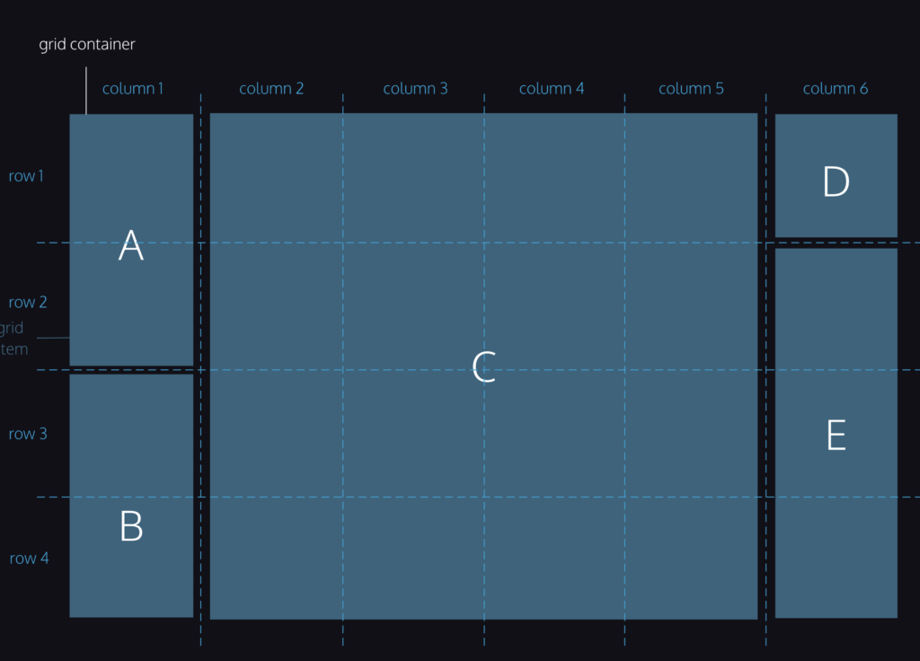
Using the CSS properties grid-row-start and grid-row-end, we can make single grid items take up multiple rows. Remember, we are no longer applying CSS to the outer grid container; we’re adding CSS to the elements sitting inside the grid.
.item {
  grid-row-start: 1;
  grid-row-end: 3;
}
In this example, the HTML element of class item will take up two rows in the grid, rows 1 and 2. The values that grid-row-start and grid-row-end accept are grid lines.
Row grid lines and column grid lines start at 1 and end at a value that is 1 greater than the number of rows or columns the grid has. For example, if a grid has 5 rows, the grid row lines range from 1 to 6. If a grid has 8 rows, the grid row lines range from 1 to 9.
The value for grid-row-start should be the row at which you want the grid item to begin. The value for grid-row-end should be one greater than the row at which you want the grid item to end. An element that covers rows 2, 3, and 4 should have these declarations: grid-row-start: 2 and grid-row-end: 5.
It is possible for the value of grid-row-start to be greater than that of grid-row-end. Both properties can also each have negative values. Consult the documentation to learn more about how to use these features.
Grid Row
We can use the property grid-row as shorthand for grid-row-start and grid-row-end. The following two code blocks will produce the same output:
.item {
  grid-row-start: 4;
  grid-row-end: 6;
}.item {
grid-row: 4 / 6;
}This code should look similar to the way grid-template is shorthand for grid-template-rows and grid-template-columns. In this case, the starting row goes before the “/“ and the ending row goes after it. Again, the ending row is exclusive; this grid item will occupy rows four and five.
When an item spans multiple rows or columns using these properties, it will also include the gap if any exists. For example, if an item spans two rows of height 100 pixels and there is a ten-pixel gap, then the item will have a total height of 210 pixels.
Grid Column
grid-column-start, grid-column-end and grid-column work identically to the row properties. These properties allow a grid item to span multiple columns.
When using these properties, we can use the keyword span to start or end a column or row, relative to its other end. Look at how span is used in the code below:
.item {
  grid-column: 4 / span 2;
}
This is telling the item element to begin in column four and take up two columns of space. So item would occupy columns four and five. It produces the same result as the following code blocks:
.item {
  grid-column: 4 / 6;
}.item {
grid-column-start: 4;
grid-column-end: span 2;
}.item {
grid-column-start: span 2;
grid-column-end: 6;
}span is a useful keyword, because it avoids off-by-one errors (miscalculating the ending grid line) you might make when determining the ending grid line of an element.
Grid Area
We’ve already been able to use grid-row and grid-column as shorthand for properties like grid-row-start and grid-row-end. We can refactor even more using the property grid-area. This property will set the starting and ending positions for both the rows and columns of an item.
.item {
  grid-area: 2 / 3 / 4 / span 5;
}
grid-area takes four values separated by slashes. The order is important! This is how grid-area will interpret those values.
grid-row-startgrid-column-startgrid-row-endgrid-column-end
In the above example, the item will start on row 2 and end on row 4, though the 4th row is not actually included, only rows 2 and 3! The item will then start on column 3 and instead of setting a number for which column to end on, we want this item to span 5 columns — this means the item will include columns 3, 4, 5, 6, and 7.
Using grid-area is an easy way to place items exactly where you want them in a grid.
Review
grid-template-columnsdefines the number and sizes of the columns of the gridgrid-template-rowsdefines the number and sizes of the rows of the gridgrid-templateis a shorthand for defining bothgrid-template-columnsandgrid-template-rowsin one linerow-gapputs blank space between the rows of the gridcolumn-gapputs blank space between the columns of the gridgapis a shorthand for defining bothrow-gapandcolumn-gapin one linegrid-row-startandgrid-row-endmakes elements span certain rows of the gridgrid-column-startandgrid-column-endmakes elements span certain columns of the gridgrid-areais a shorthand forgrid-row-start,grid-column-start,grid-row-end, andgrid-column-end, all in one line
Leave a Reply to Month 1 Day 16 – rose learns.to(‘code’);Cancel reply